Advertising was born way back in the 19th century, when soap makers decided they needed to start packaging their goods in pretty packages and hunting down buyers. But, it wasn’t until midway ito the 20th century that things got real when a particular mammoth in the advertising industry by the name of Bill Burnbach had this brilliant idea to put two particular people to work side-by-side to create some of the most impactful and profitable work in his industry.
And it worked – because before he retired, 20-some-odd years later, he had raised revenue for Doyle Dane Burnbach by $40 million dollars. So while other agencies operated with separate writing and art departments, Burnbach violently smashed these two powerhouses together to make the “Creative Department” – and lots of bad blood.
60 years later, copywriters and art directors make fun of their relationships. But they put their differences aside long enough to create work like you’ve never felt.
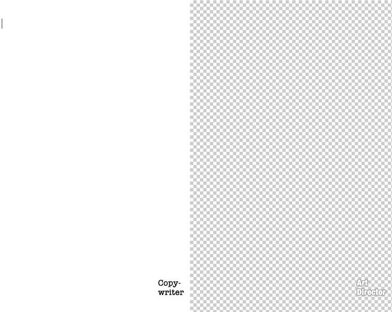
1. The Canvas
Even their starting points are different.
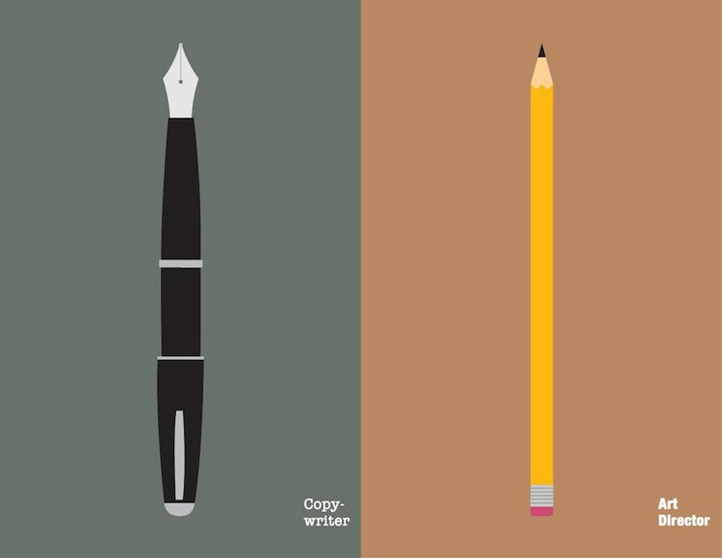
2. The Brush
The brush on the canvas also lays distinction between the two.
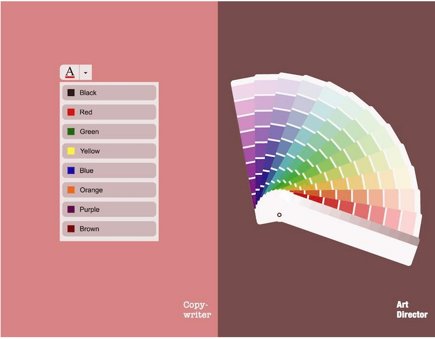
3. The Pallet
Text colors hardly have the elegance of swatches.
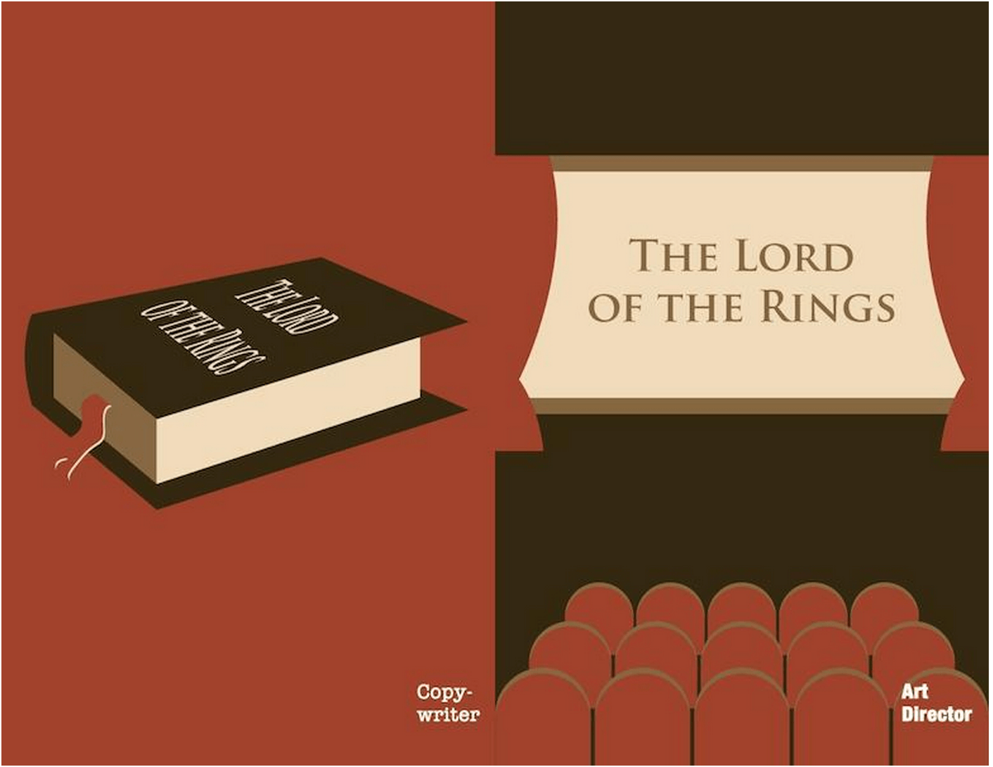
4. The Inspiration
The way the two consume inspiration is different…why read when you can watch, right?
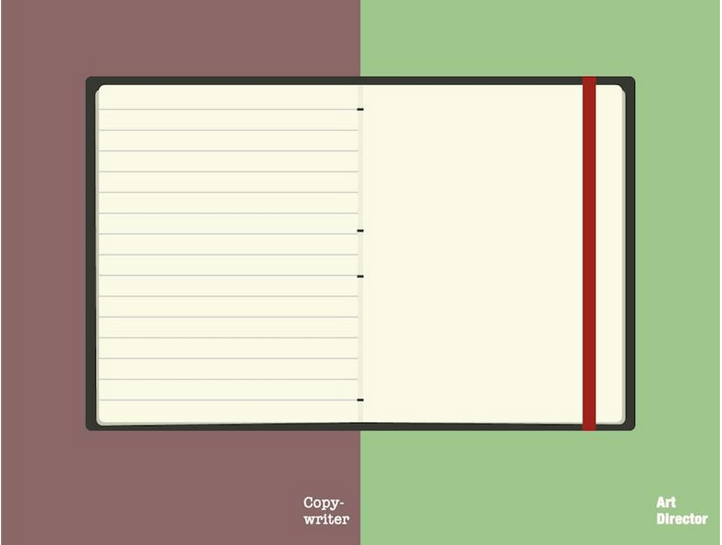
5. The Brainstorm Mechanism
Paper is paper. Or is it? Copywriters and designers will even argue which KIND of paper is better.
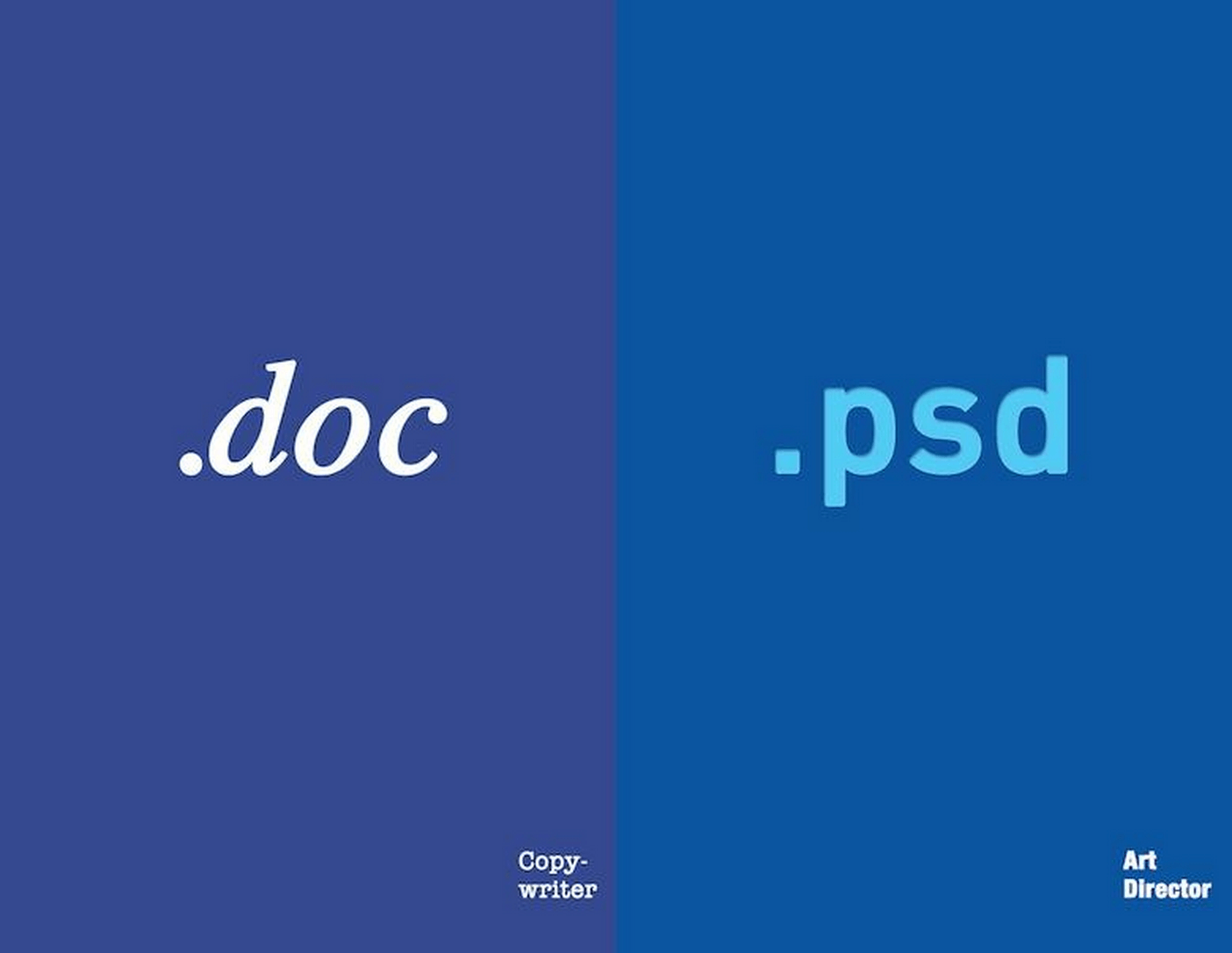
6. The Format
Whether it is .doc or .psd, it’s still a file. Not.
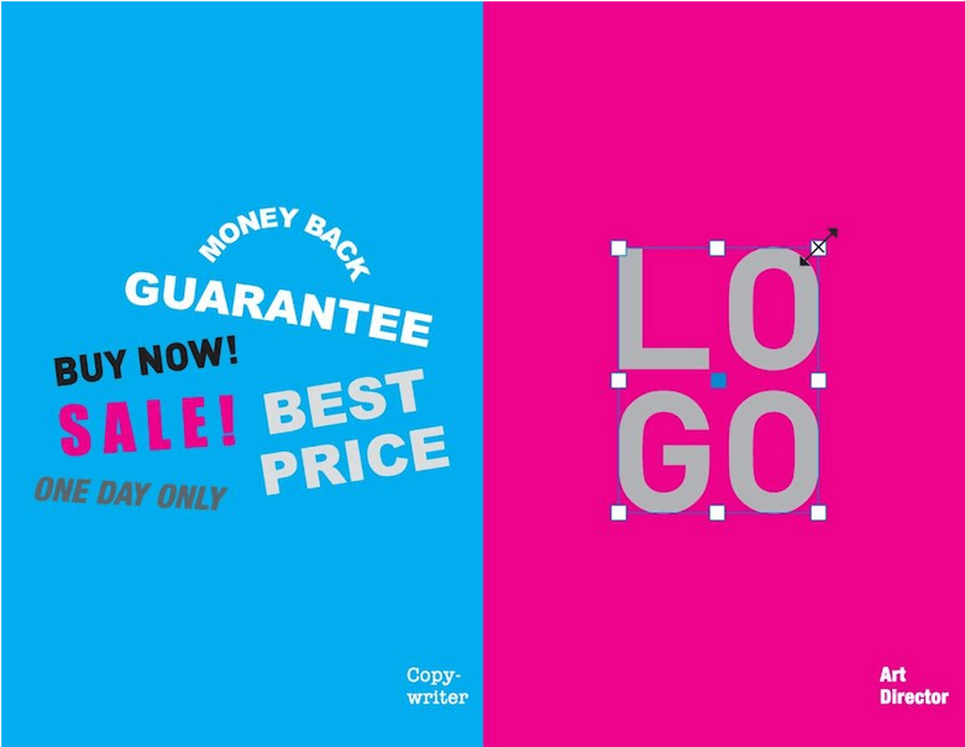
7. The Demand
The demand on the two will always be intertwined, but never will it be the same.
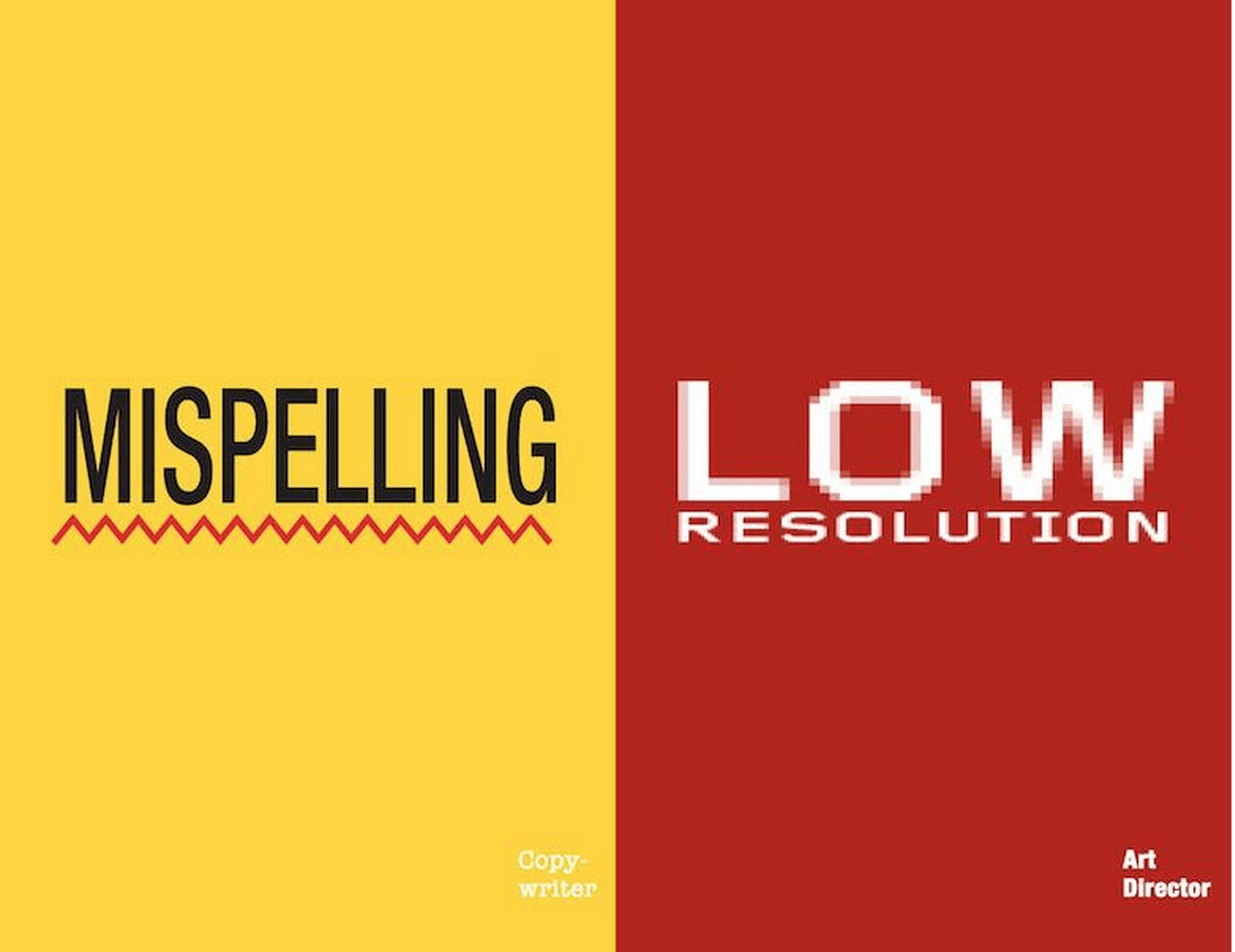
8. The Pet Peeves
Grrrrrr! We can all agree these are two pet peeves of the world at large, as well.
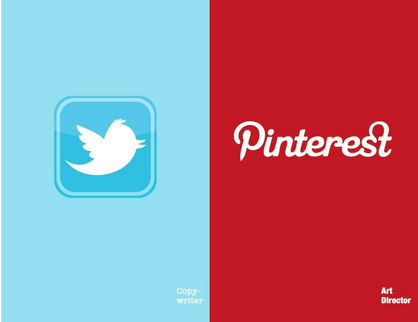
9. The Social Spot
Twitter gives copywriters the challenge they seek in being articulate and concise, but Pinterest is a designer’s playground.
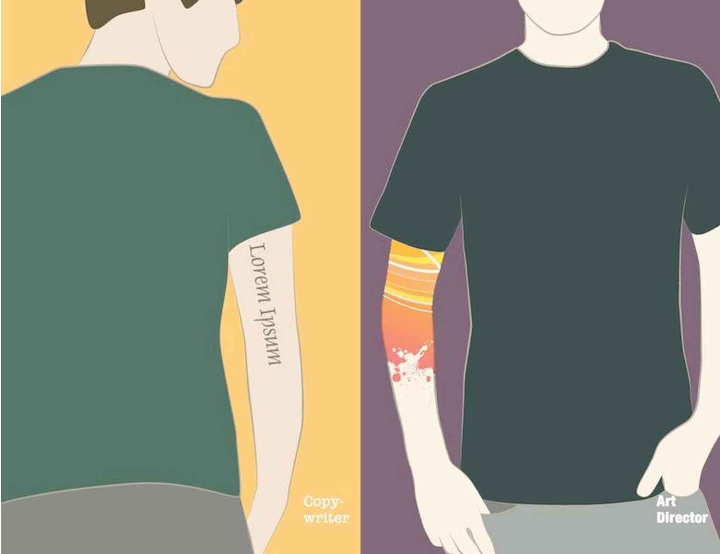
10. The Expression
Words will always be a copywriter’s first love and even our ink tends to express that. But the designer’s pen-chance for his craft is expressed in fluid lines and eye-catching colors.
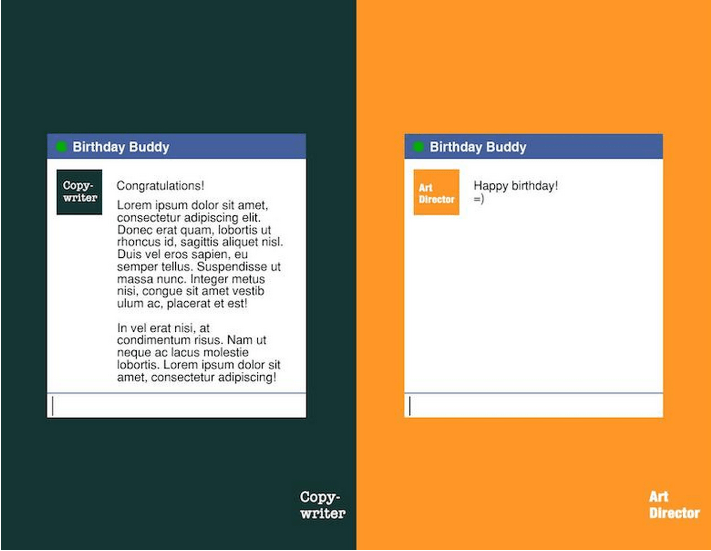
11. The Celebration
The copywriter’s salutations (while we like short and sweet, we also love persuasive) tend to be a little more verbose than our designer friends, who prefer to get to the point and get out.
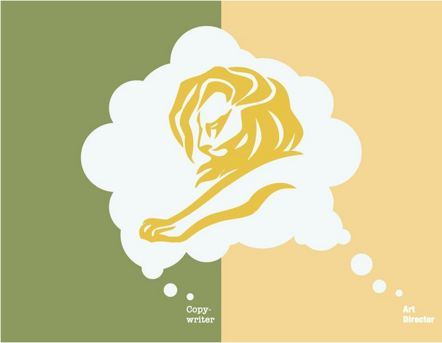
12. The Goal
But despite all of our differences, it’s the goal and the Gold Lion that keeps us powering through to the next level. So differences be damned, as long as we get there.
**Thanks to Digital Synopsis for enlightening us on the depth and breadth of this debate with their outstanding imagery.
Featured photo credit: Images via Digital Synopsis via digitalsynopsis.com
