Big Data has been a theme for 2013, and it poses the threatening question of how one can possibly interpret all the data that is available to take in.
As consumers of data, we’re constantly deciding whether to “bookmark” a particularly interesting file, or make an entry in Evernote to come back to read it later. There is so much data being generated every single minute on the Internet that it becomes increasingly time-consuming to make decisions such as: Should I read it now? Should I make a note of it in my Moleskin notepad? Should I email the link to myself?
In short, we spend more time sorting through, curating and organizing data that already exists. In doing so, we create more data about data!
Similarly, as a “provider” of information, whether you’re a recruiter looking for perfect candidates for a job, a designer showcasing your skills all in one place, or an educator speaking about a challenging topic, you too face a challenge: How do I gather the massive amount of data at my disposal in a clear, compelling format for my reader swithout losing the point?
Enter Visual Content Marketing! Realizing this dilemma, some smarty-pants on the Net came up with a unique blend of pictures and raw data—infographics.
What Are Infographics?
Infographics are visual presentations of information that compress complex ideas and present it to the viewers in a digestible format. They let you communicate hard to grasp data quickly and clearly.
An infographic could be a supplementary image for your blog post or web page, or it could be a stand-alone piece of information with little supporting text. That means you can base a whole blog post on an infographic.
A study analyzed by Jakob Nielson concludes some interesting findings. For starters, people will spend more time on your page if you cram in more words; however they only spend 4.4 seconds for each additional 100 words. More importantly, people will spend time understanding the layout and looking at the images on your page, so they realistically end up reading only 20% of text.
Since we are discussing infographics, it seemed fitting that we included this one: An infographic to explain an infographic.
Click to expand. (Source)
Why Use Infographics?
A study conducted by Wharton School of Business found that 50% of the audience was persuaded by a purely verbal presentation, whereas 67% were persuaded by a verbal presentation that had accompanying visuals.
Another study found that the color visuals of infographics increase the willingness to read by a whopping 80%.
Here are 6 reasons infographics are so effective for content marketing:
1. Humans are wired to process visual content. Think about it—would road signs be as effective if they were presented in purely text form? Most people wouldn’t even get a chance to read them while driving!
2. Humans are tired of the information overload. According to Mihaly Csikszentmihalyi, we are bombarded with approximately 2 million bits of information every second, whereas we can only process 134 bits per second. We simply can’t process the excess input.
3. Humans can recall visual content quicker than any other form. We’ll remember 80% of what we saw and did, 20% of what we read and 10% of what we heard.
4. Adding carefully crafted visuals make what we’re reading more believable.
5. Since infographics are easy to digest, attractive and fun, more people are keen to share them with others. That means more people being engaged with your content! (Speaking of fun, this infographic wins hand-down, don’t you think?)
6. The first step in converting prospects into long-term visitors and paid clients is to hold their attention. Infographics are pretty engaging by themselves and make this easier to achieve.
If you have a website or a blog, you can no longer settle with plain, boring text. For starters, no one “reads” text online. Most people will skim your page without actually using the information on the page. But with infographics, you have a neat little method to make them stay longer and want more.
How to Use Infographics
Researchers Barbara M. Miller and Brooke Barnett said:
On their own, text and graphics are both useful yet imperfect methods for communication. Written language allows an almost infinite number of word combinations that allow deep analysis of concepts but relies heavily on the reader’s ability to process that information. Graphics may be easier for the reader to understand but are less effective in communication of abstract and complicated concepts…This study showed that for the presentation of scientific information, combining text and graphics allows communicators to take advantage of each medium’s strengths and diminish each medium’s weaknesses. (p. 63, “Understanding of Health Risks Aided by Graphics with Text”)
This means it’s best to use an infographic along with a supporting piece of text. This allows an infographic to become instructional in a compelling and attractive manner. For example, on your website or blog you can embed colorful, attractive infographics that can act as a recruiting tool, present survey data, explain how things work, and compare concepts.
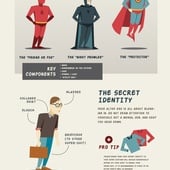
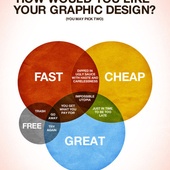
From superheroes to complicated ideas, infographics have found their place everywhere. Check out some of the most effective ones below:
Click to expand. Source: Zia Somjee
Click to expand. Source: Cool Infographics
Or, this interactive one about 13 reasons your brain craves infographics!
How to Create Awesome Infographics in Less than an Hour
Okay, you’re convinced about the effectiveness of visual content online. Being an organization or a small business, you want to give this a proper go. The next natural question that arises is: How do I create an awesome-looking infographic for my website?
The most obvious way for some people is to hire a freelance designer. But depending on whom you hire, you can end up paying hundreds or thousands of dollars and not get what you want in the end.
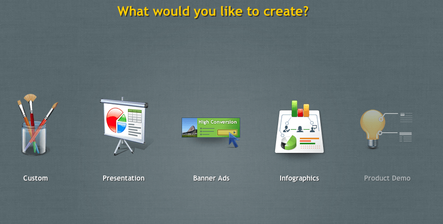
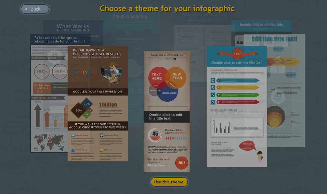
If you’re more of a DIY type and like to learn and implement new skills for life without spending any money, EWC Presenter is your go-to infographic maker. All you have to do is create a free account at www.ewcpresenter.com and choose Infographics—you can create presentations, banner ads, product demos and infographics.
There is no additional software needed to be installed as the app is cloud-based and works on HTML5. Plus the themes are beautiful!
The best part of using this app is it saves you hundreds to thousands of dollars and brings several features—such as multi-lingual options, being search-engine friendly and over 600 Google fonts—all to one place.
Check out the app for free and share your thoughts below!
