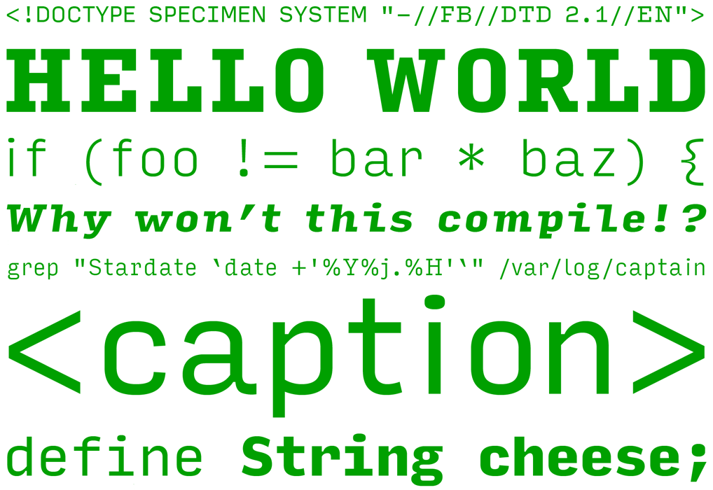
A new typeface by Font Bureau is out to help coders or programmers to develop apps and programs. Called Input, it is a family of fonts designed exclusively for writing code. Input is so interesting and easy to use that it can be used by people who wouldn’t know a line of C++ from a command line. Input serves as a great tool for programmers to read easily. According to Font Bureau, Input is a flexible system of fonts designed specifically for code. What it offers is both monospaced and proportional fonts for richer code formatting.
Why will Input make programmers’ lives easier?
When writing a story a writer chooses a font because he wants the character to communicate their text. However a programmer chooses a font for directly the opposite, he wants a generally characterless font that wouldn’t distort the massive bodies of code. With Input, a new kind of monospaced design, such as generous spacing, distinguishable characters, and large punctuation is adopted to allow each character take up the space that it requires.
Mosnospaced fonts in the past have had shortcomings such as low resolution fonts; since they were designed from traditional computer terminals and could not be used on modern machines. They were also hard on the eyes during marathon programming sessions. Such monospaced fonts also made it difficult for typos to be spotted when skimming code, although they offered large punctuation and uniform indentation.
What the designer of Input, David Jonathan Ross, had to do differently was to come up with a typeface that took its aesthetic cues and merits from monospaced pixel fonts that coders already use. Thus he also made sure he disposed the technical limitations that restricted them. By drawing each letter on a standard 11-pixel grid; he begun the process of designing Input as a pixel font. To invent a typeface that would be effective on modern devices, Ross drew the outlines of the finished letter on top of each grid.
What does Input offer?
Input may feel like a coding font when you consider the completely straight sides and its mechanical curves. Yet even though rugged, Input feels very modern. Input comes in 168 different styles, optional serified and sans serif varieties, with multiple widths. It can also be displayed in proportional and monotype styles.
The proportional styles offer a more comfortable option to the monospaced fonts which you can use for text composition and correspondence to code. The capitals get wider so they can be felt at home with the lowercase. Alongside the Normal width the condensed styles can work together. The Serif provides an alternative texture to the Sans and the Bold weight gets wider so it can be as comfortable to use as the Regular.
These features provide writers who want their text to be more prominent than their typeface. You can say it is appealing and incredible for programmers who rely heavily on formatting.
It is the belief of Input, technically speaking, that a superior alternative will improve typography in the coding world. According to the makers of Input, the Font Bureau, “by mixing typographic variation with the power of syntax highlighting, by composing text that transcends a fixed-width grid, and by choosing and combining multiple font styles, we can end all up with code and data that is ultimately easier to read and write.” Input hopefully is a sign that there will be a typographically rich future when coding environments, that programmers will overcome technical constraints and have full control over their display.
If you visit the marketing page of the Font Bureau you will find a live preview of the font with real code. Input is available for free download for private and unpublished usage.
Featured photo credit: Lazy Morning Programming in A Bed/VIKTOR HANACEK via picjumbo.com


