From word clouds to network data visualizations, infographics have become a primary format for content in a relatively short period of time. Although the ‘infographic’ is nothing new, its proliferation and evolution has been nothing short of exponential in the past few years.
Whether you love them or hate them, the rising popularity of infographics can’t be denied.
If you want to get a message across, whether it is for your business, blog, or book club, using an infographic can be the best way to do it. If you’re incapable of drawing a recognizable human stick figure, let alone an entire data visualization, you may be agonizing over the disturbing fact that infographics are all the rage.
It just so happens that there are many people out there who want to deliver a message using an infographic who do not have any artistic skills. It’s lucky for us that tools and resources have popped up all over the place to help even the most hopeless of us (like me) create beautiful infographics.
I’m going to show you how to do it in thirty minutes or less.
Rules of Engagement
Before we get into the nitty-gritty, there are some basic rules you need to follow when creating infographics. At least you need to follow them when creating infographics people will want to actually read.
Just because you’ve put together a picture with words and numbers doesn’t make it an infographic, certainly not an effective infographic. Before starting, make sure you have the following rules in mind:
- Make a point: Don’t just slap useless numbers on a chart. Your infographic needs to have a clear and strong beginning, middle, and an end. It must read like a story, not like an excerpt from a trivia book.
- Don’t waffle: If you find a juicy piece of data that fascinates you but isn’t relevant to your message, please refrain from including it in your infographic. Go marvel over it in private and don’t take your readers off on a tangent. Stick to the point and make it simple.
- Check yourself before you wreck yourself: For the love of all that is good in the world, do not go to randomguysblog[dot]wordpress[dot]com and assume that all information there is fact. Get your information from credible sources and cite them at the bottom of your infographic.
- Brand it: Make sure it’s clear that you or your organization created the infographic.
- Make it sharable: Whether you include tweetables, a Pin It button, Facebook share, or whatever your social network of choice is, make sure that people can spread the word about your new stunning infographic. Don’t forget to also include embed code so people can put your infographic on their own website.
Creating Your Infographic
Since this is an article about infographic creation, it seemed appropriate that I should include an infographic. I’m going to create this infographic using the steps outlined below
Step 1: Research
It’s called an infographic for a reason. You have to include some useful information. Without it, your infographic becomes art. Worse, it becomes very bad art. So, do your homework and do it well. You may be able to skip this part if you’re a true expert in your topic, but even then, it’s good to do your homework. It’s important to do this part first, since the data you decide on displaying will determine what kind of infographic you need to create.
Step 2: Choose a Template
I use Piktochart to create all of my infographics.
Out of all the tools I’ve used, Piktochart is by far the best when it comes to a combination of flexibility, options, and overall ease of use. The trick is to pick a template that will do a good job of representing your data without you having to modify or customize it too much. This is where your research from step one comes in. Use it to decide what kind of layout will best suit your data.
Piktochart offers a wealth of templates, so you won’t have a problem. You can sign up for a free account or paid account. If you plan on creating infographics more than a few times and you want to do it without spending hundreds of dollars on a graphic designer or losing your mind, I suggest investing in the paid account.
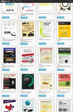
Here’s a snapshot (on the right) of just a few templates I can choose from in my Piktochart account.
Step 3: Insert Data & Customize (30 minutes)
Take all the data you gathered from step one and put it into the template. Although we’ve basically eliminated the need to consider the design of your infographic, it’s still important that you can present the data in an organized and sensible way. Use arrows to help information flow and make it scannable as you would a blog post.
Step 4: Reveal Your Infographic to the World
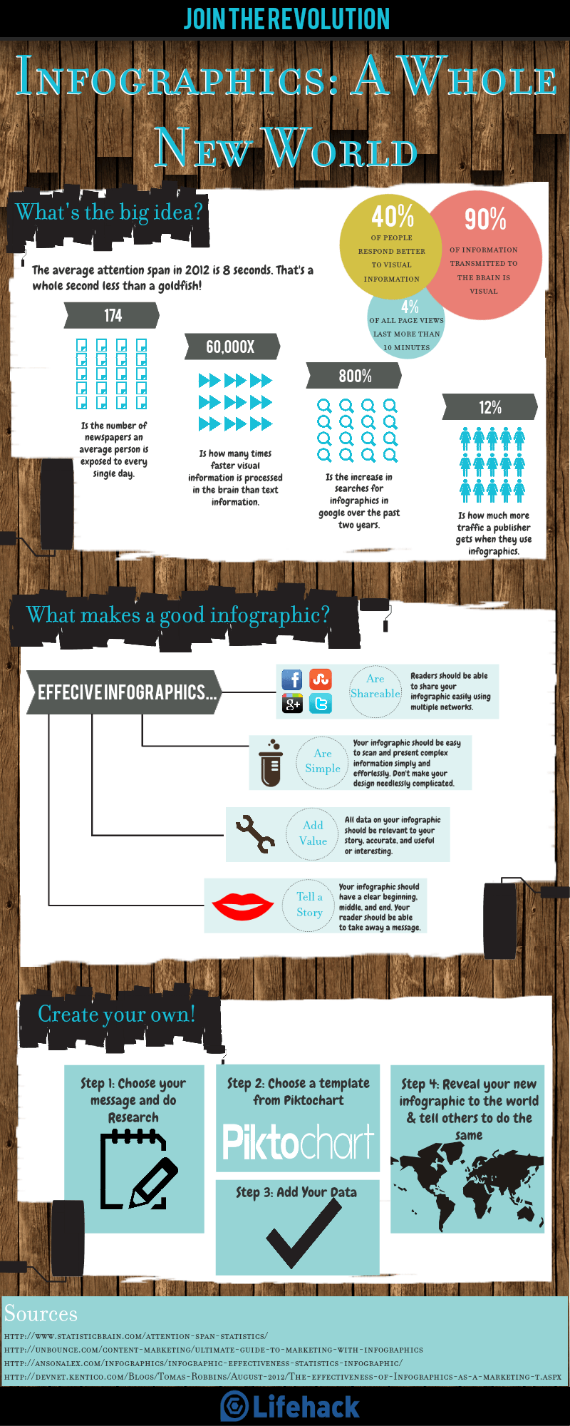
Here’s the infographic I made in 32 minutes as a demonstration for this article. After doing the research, it was just a matter of organizing my data and inserting it. I had to do only a little customization since I picked a template that suited my data well.
If you are willing to spend a bit more time, you could make your infographic longer and more in-depth!
Add this infographic to your site:
<img src=’https://cdn.lifehack.org/wp-content/files/2012/11/LifeHackInfographic.png’ alt=”How to Create Stunning Infographics in 30 Minutes or Less”>
<a href=’http://www.lifehack.org’ title=”Create An Infographic”>Lifehack.org</a>
Featured photo credit: Downwards shot of woman employee via Shutterstock


