When you have data to share in an article, presentation, or a blog, a great way to illustrate your point is through the use of an infographic. Statistically, the brain processes images 60,000 times faster than text, according to Market Domination Media. To capture your readers and improve your "shareability," create an infographic.
Below, you can see what makes an infographic "bad," and what you can do to improve it.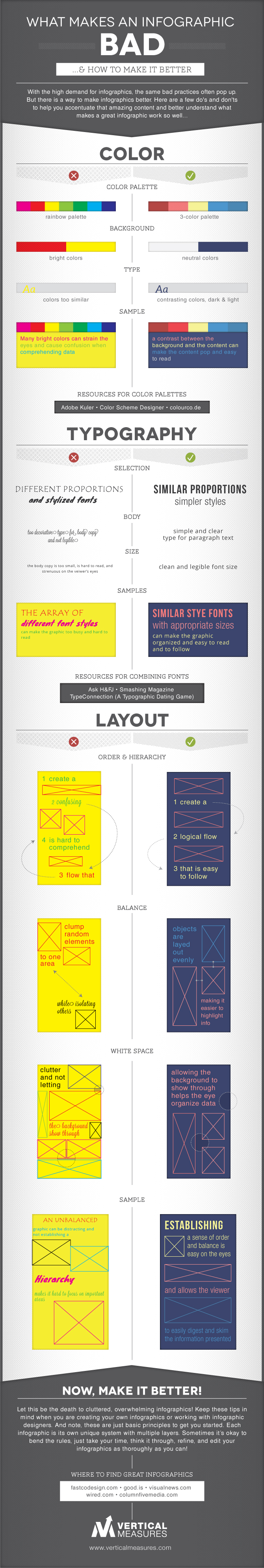
Below, you can see what makes an infographic "bad," and what you can do to improve it.
Step 1: Color
Choose complementary colors that are easy on the eyes.Step 2: Typography
Keep fonts consistent, easy to read, and choose ones that go together.Step 3: Layout
Align your spacing, and keep it uncluttered. This helps the flow for your readers and keeps them interested.