The field of advertising is becoming increasingly diverse as a growing number of firms across multiple industries move into the online space. Social media marketing budgets are expected to double in the next five years, for example, with LinkedIn, Twitter and Facebook the three most popular platforms.
Online advertising is just one of many accessible marketing platforms in 2014, however, and the majority of innovative marketers launch their products or services across an integrated range of both online and offline mediums. This not only boosts the likelihood that an advert or brand message will reach as large an audience as possible, but it also enables businesses to combine images and text that have a powerful impact on viewers.
With this in mind, let’s consider some of the most powerful and impactful advertisements of recent times, and look at how they have influenced and inspired viewers. We give you…
Social Issue Advertising Campaigns
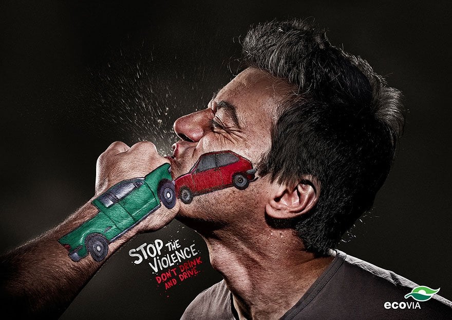
1. Stop the Violence: Don’t Drink and Drive
Drunk driving has inspired numerous bold and cutting-edge advertising campaigns in the modern age, but none have been as visually striking as the one commissioned by the Terremoto Propaganda agency in Brazil. The imagery, which depicts a graphic scene where one man is striking another, utilises painted vehicles on the hand and face to replicate the impact of two cars colliding. Its use of the slogan “Stop the Violence, Don’t Drink and Drive” underlines the message, while drawing a direct parallel between reckless driving and pure acts of aggression.
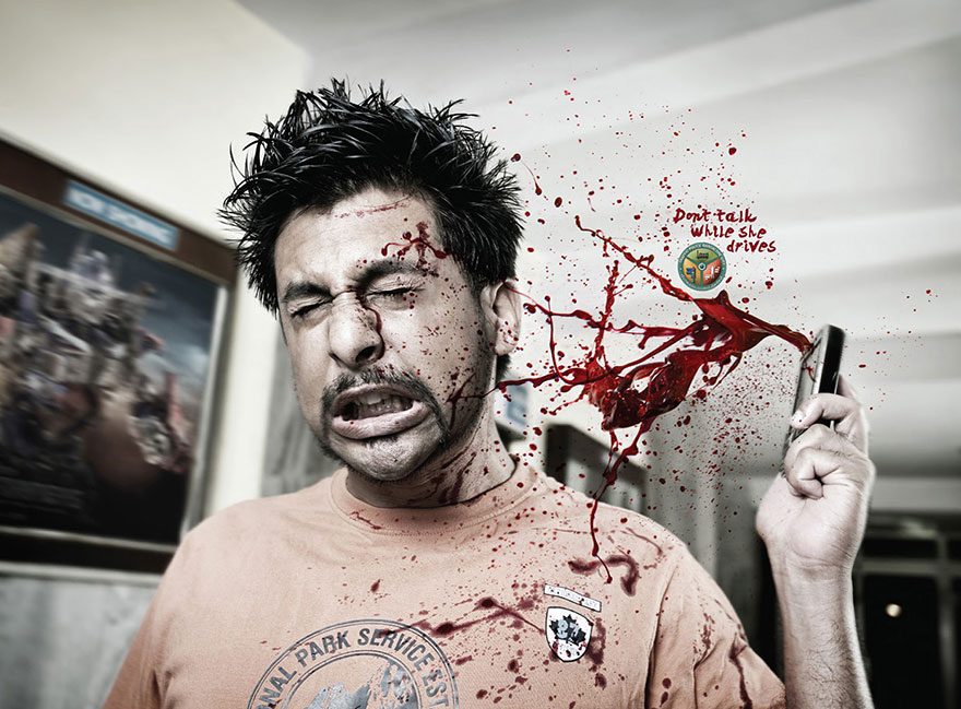
2. Don’t Talk While Driving
On the subject or responsible driving, the Bangalore Traffic Police took the unique step of commissioning this advert from the Mudra Advertising Group in India. By also incorporating concise but impactful text alongside vivid and shocking imagery, it looks to highlight the damage that can be caused by using mobile devices while driving.
3. Distracted Driving: Think of Both Sides
This advertisement follows a similar theme, although it was designed to reinforce the importance of road safety during the school holidays. Created by the Russian advertising agency Red Pepper, its subtle visual and engaging tagline certainly highlight the dangers that distracted drivers pose while out on the road. By imploring motorists to “Think of Both Sides,” it also challenges behaviour and encourages drivers to remain focused at all times.
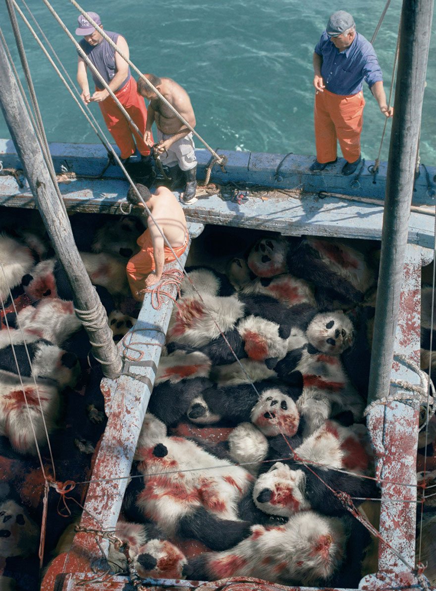
4. When You See a Tuna, Think Panda
Cruel treatment of animals is always an emotive theme. This topic has been tackled head-on by the Sea Shepherd Conservation Society and the Ogilvy & Mather agency in Singapore, who use this distressing and graphic imagery to educate viewers on the realities of tuna fishing. The tagline also creates a simple association between tuna and the treatment of pandas, which may have a more long-lasting impact in the minds of consumers.
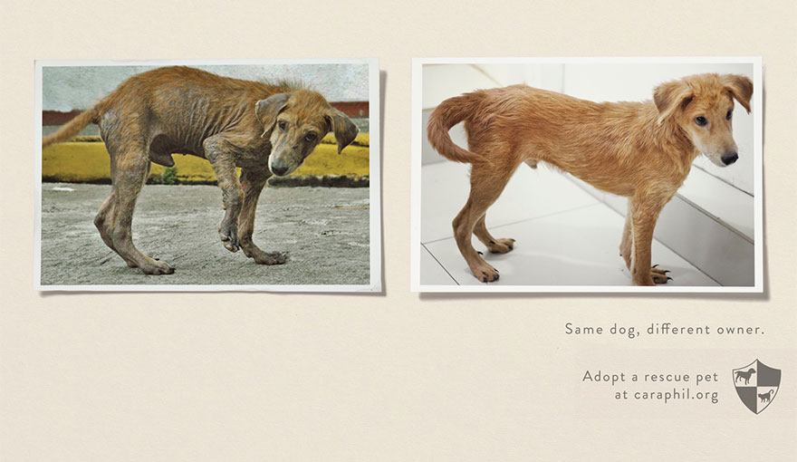
5. Animal Abuse and Shelters: Same Pet, Different Owner
While the TBWA-Santiago Mangada agency may have used less graphic imagery to underpin their “Same Pet, Different Owner” campaign, they have created a simple and visually concise concept to drive home the message. The campaign simply utilises before and after photographs of the same pet, highlighting how neglect and abuse can impact their physical condition. It certainly reinforces the responsibility of pet owners and encourages a higher standard of care.
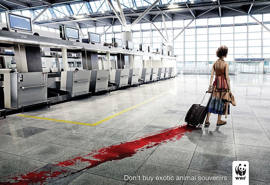
6. Don’t Buy Exotic Animal Souvenirs
Mopving from the simplistic to the complex, this conceptual advert by the Lowe GGK Advertising Agency in Warsaw, Poland, manages to be extremely artistic without compromising its messaging. Featuring a colourfully dressed tourist who leaves a trail of blood as she drags along her suitcase, the image captivates the viewers’ attention before the strong tagline “Don’t Buy Exotic Animal Souvenirs” drives home the key message. Published on behalf of the WWF, it discusses an extremely topical social issue and encourages curiosity about the treatment of exotic animals.
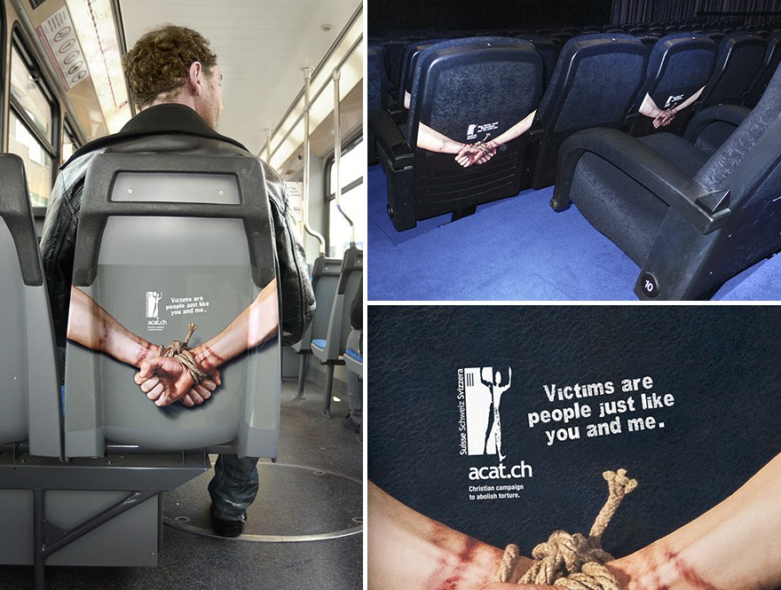
7. Torture Victims Are People Just Like You a
The issues of modern slavery and human trafficking have gained significant media attention in recent times, which has triggered a number of advertising campaigns aimed at educating citizens. This effort, which was created by the renowned Advico Y & R Agency in Zurich, Switzerland, features a creative use of imagery and space to capture a target audience on various types of transport.
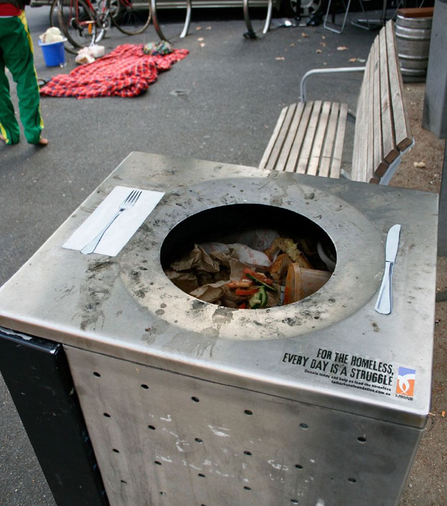
8. For the Homeless, Every Day Is a Struggle
In terms of creativity, the Clemenger Advertising Agency in Melbourne followed a similar thought process when developing a campaign to raise awareness about homelessness in Australia. By utilising public bins and incorporating a design that featured a knife and fork on either side of the disposal port, the group were able to make people consider the plight of the homeless during their everyday interactions. The tagline is also emotive, as it encourages us to place our own issues into perspective when considering others.
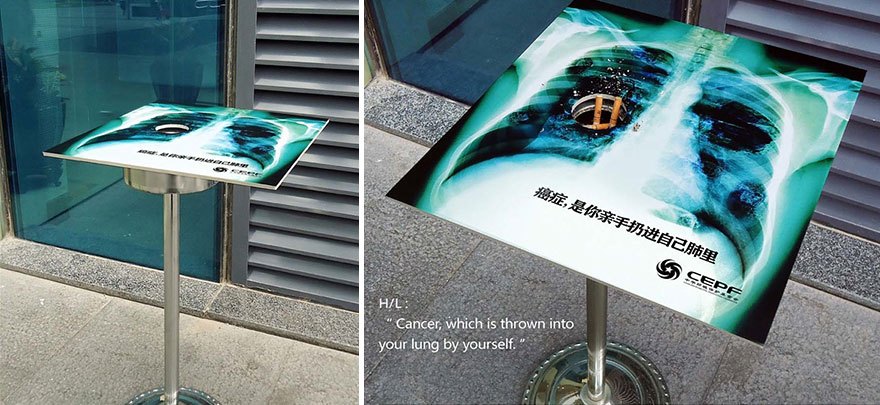
9. Causing Cancer by Yourself
When highlighting prominent social or health issues, the key is undoubtedly to create eye-catching, three-dimensional advertisements that engage people during their everyday activities. The “Causing Cancer by Yourself” campaign managed to be breathtakingly simple and innovative in equal measure, as it placed a public ashtray inside a sparse image of a human lung and rib cage. Created by the Dentsu Advertising Agency in China, the visual effect was instantaneous and extremely thought-provoking for smokers.
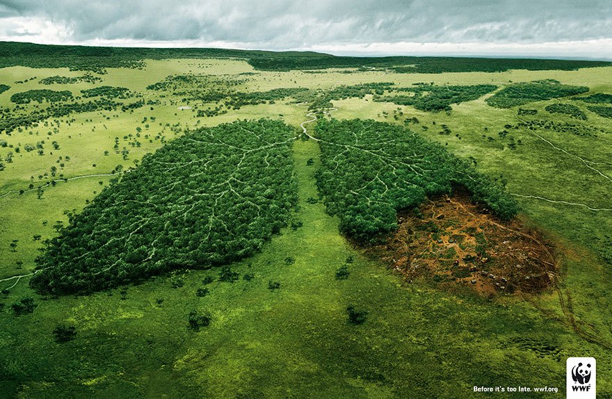
10. Deforestation and the Air We Breathe: Before It’s Too Late
As the recent discussion on implementing climate controls proves, governments throughout the world need to create a healthier natural environment for global citizens. This was also the motivation behind a recent campaign conducted by the TBWA Agency in Paris, where the imagery of devastated forest regions in the shape of human lungs draws a direct parallel between deforestation and subsequent respiratory problems.
The Most Impactful Print Advertisements
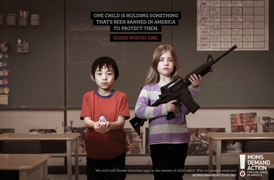
11. Moms Demand Action: Choose One
In a world of advanced graphics and digital technology, it’s easy to lose sight of how impactful single, still images can be. One of the most emotive and memorable print campaigns was commissioned by the Moms Demand Action Group, who used images of children holding a innocent childhood obejcts (a Kinder Surprise egg, the fable Little Red Riding Hood, a dodgeball ball) alongside youngsters holding automatic weapons. The tagline “Choose One” drew on the fact that the former three items had all been banned from U.S. school in the interests of child safety, while guns were still legalised. Thought-provoking and simple in equal measure, it certainly triggered a great deal of debate nationwide.
12. Some Toys Never Die
More often than not, print advertisements must be extremely creative as they cannot rely on gimmickry or audio-visual features. This terrifying and extremely innovative campaign provides a relevant case in point, as Singapore-based agency Grey used sinister imagery and a compelling tagline to promote Duracell’s new longer-lasting batteries. The use of lighting certainly engages viewers, while the level of creativity demands further attention.
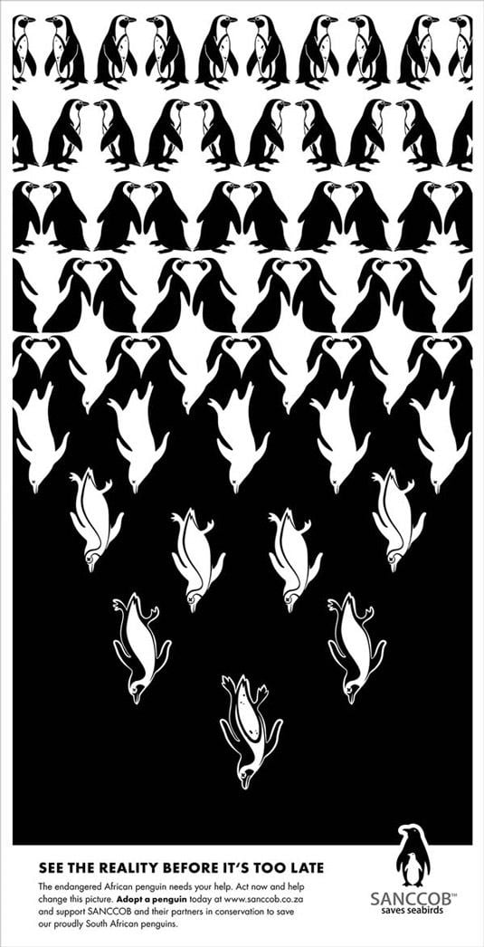
13. SANCCOB Saves Seabirds
As a species in decline, the African Penguin has garnered a significant amount of attention in recent times. With African Penguin Awareness weekend having finished on 13th October, South African agencies SANCCOB and Bittersuite have collaborated to create this artistic print advertisement that highlights the plight of the species. While the first two tiers of designs include optical illusions that draw the viewer in, the third draws inspiration from optometrist’s eye charts and illustrates the timeline of evolution. This leaves you with a thought-provoking message, and succeeds in raising considerable levels of awareness.
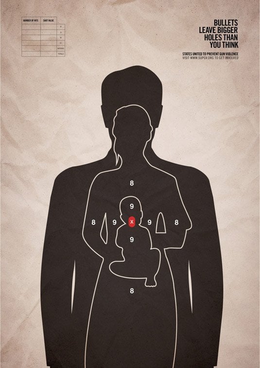
14. Holes
In terms of sheer simplicity and instantaneous visual impact, the “Holes” campaign to prevent gun violence in the U.S. stands out. Created by the Grey marketing agency in New York, the advertisement uses the trace outline of three human targets within a single space to highlight the devastating impact that gun crime can have on families. The aim of the campaign was to raise awareness about outdated gun laws in the U.S., and the tagline “Bullets leave bigger holes than you think” certainly underlines the impact of the visuals.
15. B & B Hotels: Bacon
On occasion, advertisements are impactful solely due to a creative visual concept and a stunning execution. This is certainly the case with this advert, which was designed artistically by German agency Publicis for a prominent B & B chain. Simply by engaging the reader with a literal interpretation of the bed and breakfast concept, it uses colour and clever imagery to charm consumers and make a distinct mark. This is a simple and yet effective way of influencing consumer decision, especially in a crowded and often stale marketplace.
16. Panasonic: Ideas for Life
On a similar note, Panasonic’s unique “Ideas for Life” campaign also used outstanding graphics to sell individual products and promote advanced technology. This advertisement certainly showcases the benefits of 3D television, while using colour, tone and artistic visuals to highlight the full potential of the associated technology. The attention to detail on the advert and the treatment of shadow and lighting is particularly impressive, and it really challenges viewers to understand the immersive nature of three-dimensional technology.
17. Maximidia Seminars: Vintage Twitter
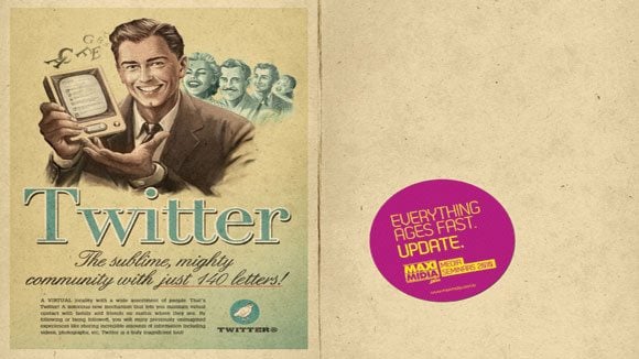
The subtle use of contrast is a renowned print marketing technique, especially when it creates juxtaposition between the old and the new. The Maximidia Seminars print campaign provides a relevant case in point, as it used a series of plays on Facebook, Skype and YouTube to highlight the obsessional nature of social media and the rapid pace of change within the technology sector. Educational and quirky in equal measure, its Twitter piece is especially memorable and uses an old-fashioned print advert as a backdrop for the technology and Maximidia’s own, colourful branding.
18. Tooth Avenue Dental Care: Who’s Afraid of the Big Bad Wolf?
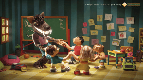
The best adverts, print or otherwise, change perceptions. Take the recent campaign by the DM9JaymeSyfu agency, for example, which sought to change the typical perception of dentists while encouraging parents and children to visit their local practitioner regularly. Featuring an extremely creative execution, beautifully presented clay models and a clever twist on the concept of the Big Bad Wolf, the advertisement is warm and comforting and successfully challenges the stereotypes and misconceptions that surround dentistry in 2014.
19. Don’t Drive Sleepy
We have already discussed some powerful and emotive advertisements that aim to create awareness about reckless driving. This print advert deserves to be recognised for its brilliant simplicity and efficiency, however, as it manages to convey a strong message with the use of basic illustrations and excellent photography. The ‘Don’t’ Drive Sleepy’ campaign, which was created by the BBDO agency in Bangkok, underlines the precise impact of driving when lethargic in a graphic and thought-provoking manner.
20. Sanzer: What you really touch?
In the wake of recent viral outbreaks throughout the world, people are increasingly aware of the need for sanitisation. This advertisement certainly makes the point graphically, by using outstanding Photoshop techniques to present dirty fingers emerging from a public payphone keypad. Boasting shocking visuals and the thought-provoking tagline ‘What you really touch’, Sanzer’s advertisement certainly delivers a powerful message and encourages viewers to wash their hands regularly.
High Budget Audio-Visual Advertisements
21. The Need for Speed: The Ford Mustang
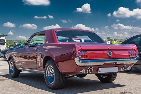
The Ford Mustang is one of the most iconic and historical vehicles in the history of automobiles, having recently celebrated its 50th anniversary in 2013. It commemorated this landmark in style thanks primarily to a video adaption of the popular video game ‘Need for Speed’ that featured Breaking Bad star Aaron Paul. This adaptation was essentially a large-scale advertisement for the brand-new Shelby GT500 Mustang, and the collaboration between Ford and DreamWorks certainly produced an engaging spectacle that created significant awareness about the release of the vehicle.
22. CaesarCasino.com: The Snooker Shootout
Playing blackjack online in NJ has emerged as a highly lucrative business, driven by innovative promotions and high advertising spends. Sometimes the best campaigns in this sector are led by creating an immersive experience rather than the publication of on- and offline materials, and the New Jersey-based CaesarsCasino.com Snooker Shootout event underlined this perfectly. By hosting a high-octane event that transcended the online gambling industry, Caesars were able to promote their brand and newly-launched online platform while also challenging existing perceptions surrounding the sector.
23. Australian Post: If You Want to Touch Someone, Send Them a Letter
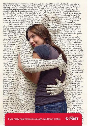
If we have learned one thing from this list so far, it is clear that the best advertisements evoke some form of emotion from viewers. Whether this takes the form of shock, joy, or sadness, the key is to engage individuals and immerse them in a brand or social cause. This was certainly the primary goal of Australian Post’s recent brand awareness campaign, which sought to challenge the impact of technological advancements and reinforce the emotive nature of sending a loved one a letter. The imagery certainly captures the unique nature of the written word, while creating a sense of warmth and happiness among viewers.
24. Beck’s: Art in Progress
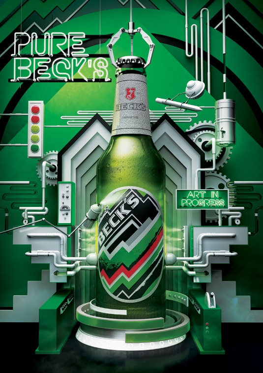
Leading beer brand Beck’s operate in what is arguably the single most competitive market imaginable, and it has therefore take drastic artistic measures to emerge from the crowd. In partnering with British based design studio Vault49, Beck’s has commissioned a flowing, production line inspired visual that explores the various elements that create the beverage in a conceptual manner. This artistic advert demands further attention, and helped to distinguish the brand from a swathe of similar competitors.
25. AXE: Unleash the Chaos
The deodorant brand AXE has earned a great deal of attention in recent times, thanks primarily due to its innovative print and television campaign aimed at launching a brand new fragrance. Entitled ‘Unleash the Chaos’ it promotes the new Anarchy products for him and her, relying on simple but stunning graphics in its print materials and spectacular cinematography for its television advert. The agency BBH have developed a reputation from creating innovative campaigns around simple themes, and this is certainly one of the most visually impactful.
26. Nike Fuelband
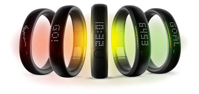
If there is one brand that epitomizes innovation in advertising, it is sportswear brand Nike. It is particularly adept at storytelling, and more specifically evolving an already global brand with new products and advertising campaigns. The launch of Nike Fuelband offers a relevant case in point, as it created a seamless fusion of product and marketing while also adding a new chapter to its narrative. Not only is this advertising campaign visually engaging in the extreme, but it is also a premier example of creative and holistic marketing at its finest.
27. Harvey Nichols: Sorry, I Spent It on Myself
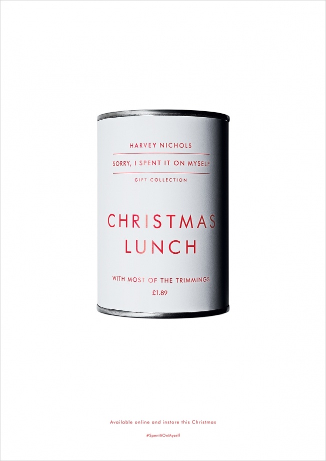
At the opposite end of the spectrum, we have a more simplistic and cleaner campaign aimed at the launch of a brand new range. This humorous and iconic advertising campaign, entitled ‘Sorry, I Spent it on Myself’, reveals a range of affordable products that enabled consumers to save their money and spend it on indulging themselves. While these products were only designed for novelty value, these adverts also underlined the importance of rewarding yourself for all of your hard work throughout the tyear.
28. A Piece of Freedom
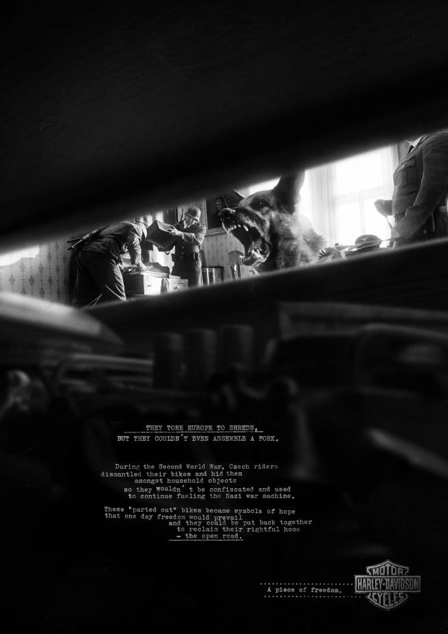
This haunting advertising campaign manages to be both shocking and emotive while also remaining within the boundaries of good taste. Thanks to collaboration between PHD Bikes Harley Davidson and advertising agency Y & R in Prague managed to achieve this feat, however, by creating a campaign that tapped into a unique aspect of Czech history during the Second World War. More specifically, it narrated the story that Czech riders would dismantle their bikes during the Nazi occupation to prevent them from using parts to power Hitler’s war machine. These hidden components became symbols of hope and freedom, and this is encapsulated perfectly by the visuals and copy used in the advert.
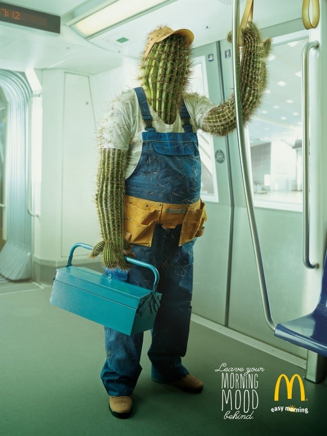
29. Leave your Morning Mood Behind
We are all prone to morning moods, and fast food giants McDonald’s embodied this perfectly when marketing its new range of breakfast products. Entitled ‘Leave your Morning Mood Behind’, this DDB Tribal campaign ran in Austria and relied primarily on unique visual effects to share the brands message. By translating a range of moods into imagery, the campaign reached a wider number of consumers and communicated with them on an individual basis.
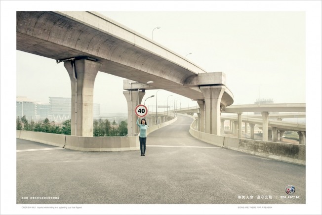
30. Signs Are There for a Reason
It seems fitting to finish on an advertisement that combines the very finest in creative thinking, visual effects and emotive imagery. The ‘Signs are there for a Reason’ campaign is therefore a suitable departure point, as it uses real victims of motoring accidents and depicts them stood in a street holding the precise. Not only is this imagery sparse and brooding, but this collaboration between the Shanghai General Motors Company and the Lowe advertising agency draws a tangible parallel between the acts of reckless drivers and the individuals who they injure.
Featured photo credit: Wrote / Flickr via flickr.com
